More community, less extra work.
Volunteers in Santa Fe have little time and few resources. banda helps them prepare, coordinate and share workshops, without adding extra work.
- Type
- Mobile web app (PWA) · New product
- Context
- Individual project · UX/UI Design, Mediadesign Hochschule · 2 months · 2026
- Role
- UX/UI Designer, end to end
- Tools
- Figma · Miro

- 6 research themes → 4 design principles
- 5 product areas → 3 core flows prototyped
01Overview
banda is a mobile web app for volunteers in community organizations in Santa Fe, Argentina. Besides an afternoon snack or a meal, these organizations offer workshops where volunteers share time and activities with children, teenagers and adults. banda gives them ready-to-use activity ideas, coordination and a shared space to exchange experiences. The name comes from Argentine Spanish, where “banda” means “your group, your people”.
02Context & research
The context
In the city of Santa Fe, 164 community soup kitchens support 28,922 people (official city list). Beyond food, many offer workshops in crafts, sports and culture, almost always run by volunteers with very little money, material or storage space.
Where it started
banda builds on my research at the Universidad Nacional del Litoral (Cientibeca scholarship, 2017–2018). I worked with La Funda, a foundation in the Chalet neighborhood with more than 20 volunteers and around 75 children. The goal of that research was to propose an experience from Industrial Design, so the idea of a shared platform was not developed further. With banda, I turned it into a product.
Methods
- Re-analysis of my interview with the coordinator of La Funda
- Survey with 10 volunteers: available time, how they cope without material, how topics like poverty affect them
- Updated context data on volunteering in Argentina
- Empathy map and 3 personas
Personas
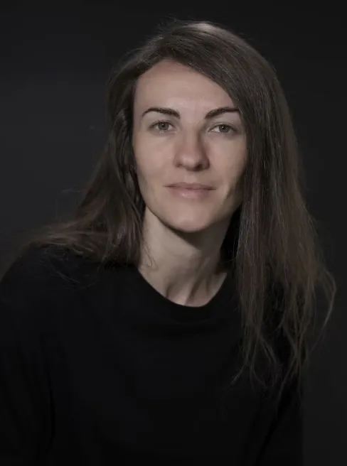
“We don’t give workshops, we make them together with the kids.”
Leads 20 volunteers. Needs an overview of material and reliable communication.
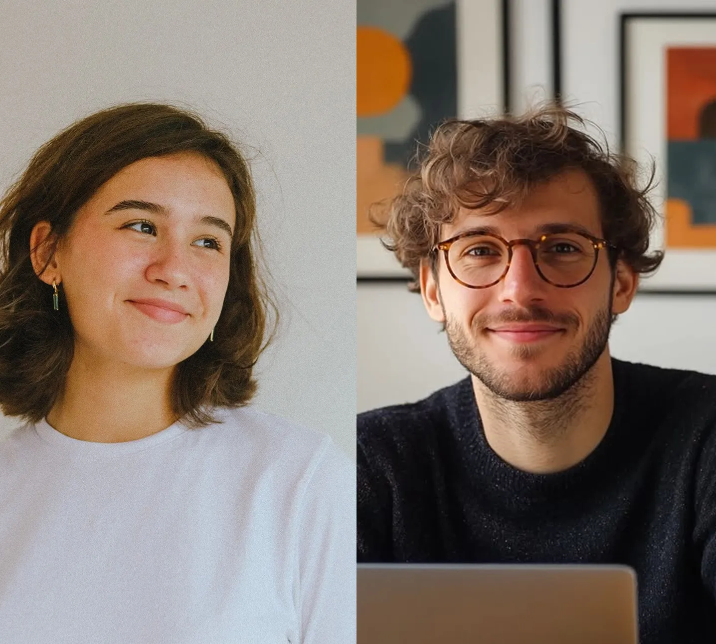
“I help a few hours a week, whenever I have time next to my studies.”
Need flexible schedules and clear information.
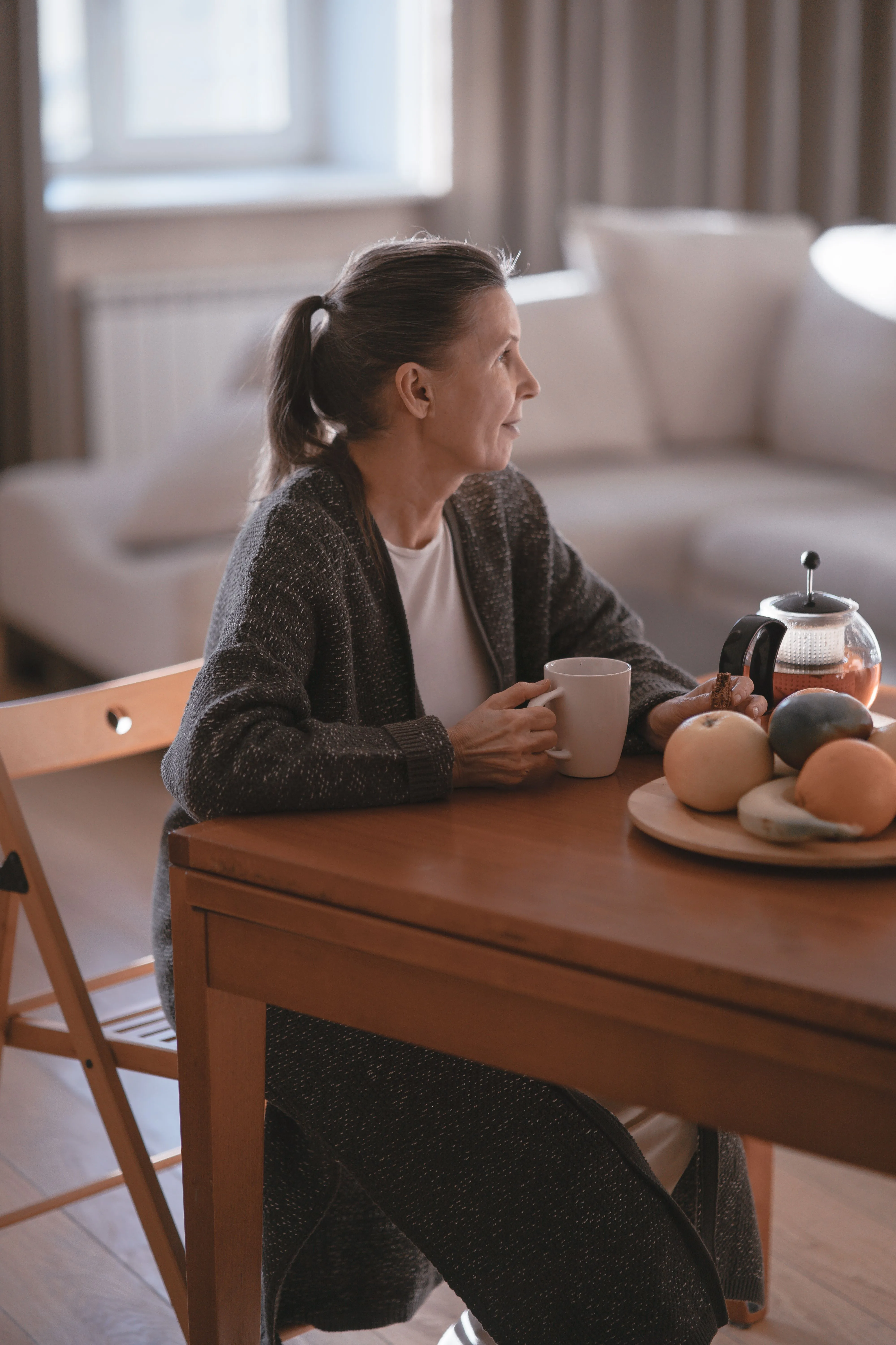
“My kids are grown up, now I have time to do something for others.”
Needs simple, large controls and clear instructions.
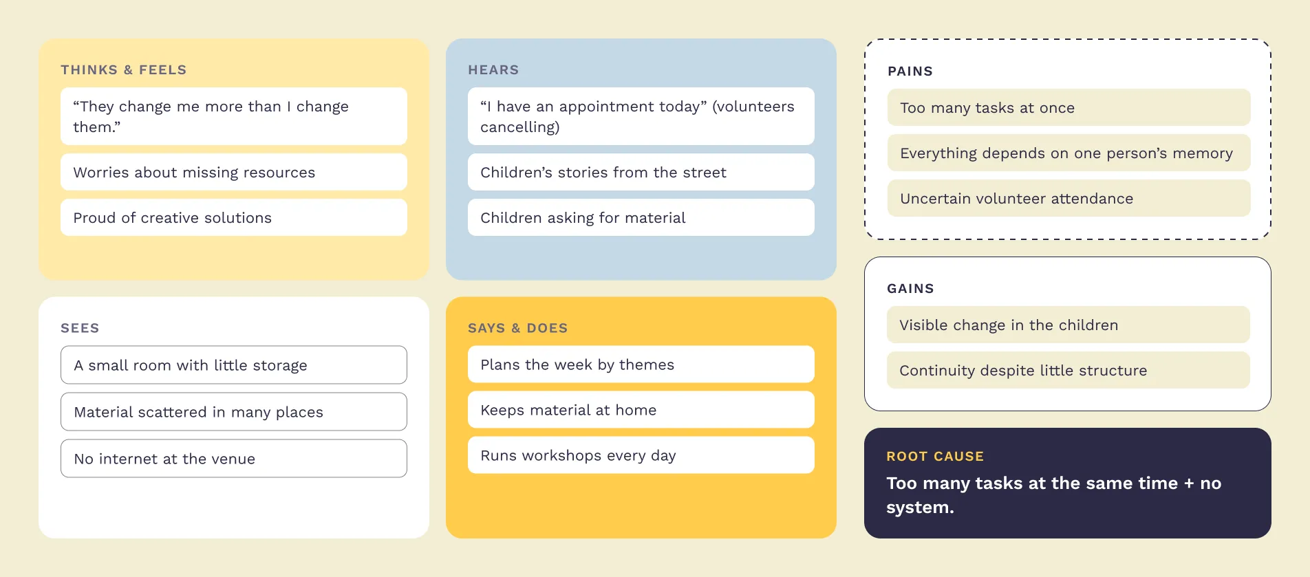
Empathy map
The coordinator is the bottleneck: everything depends on her memory. So I started with her. If volunteers can find the plan, the material and the topic of the day on their own, her load goes down.
03Insights
I grouped the findings into six themes. Each one led to a key insight.
- 1Workshop planningThe weekly structure exists. What’s missing is ready-to-use content for each day.
- 2MaterialKnowledge and material depend on one person’s memory. A shared system would create stability.
- 3Volunteer coordinationVolunteers are committed but structurally unreliable. The answer is flexible coordination, not more obligation.
- 4Knowledge exchangeOrganizations solve the same problems in isolation. Interest in sharing still needs to be confirmed with more interviews.
- 5Difficult topicsVolunteers without teaching training already use films and drawings to start conversations, but lack tools for the conversation itself.
- 6DonationsLack of money is structural, but how organizations handle it (like fair distribution) is something they can learn from each other.
04Define
Four design principles
- 1Little timeEvery action has to be quick.
- 2No obligationThe app should motivate, not pressure.
- 3No conflictThere is no open chat.
- 4Human warmthThe app should feel warm and friendly.
Scope
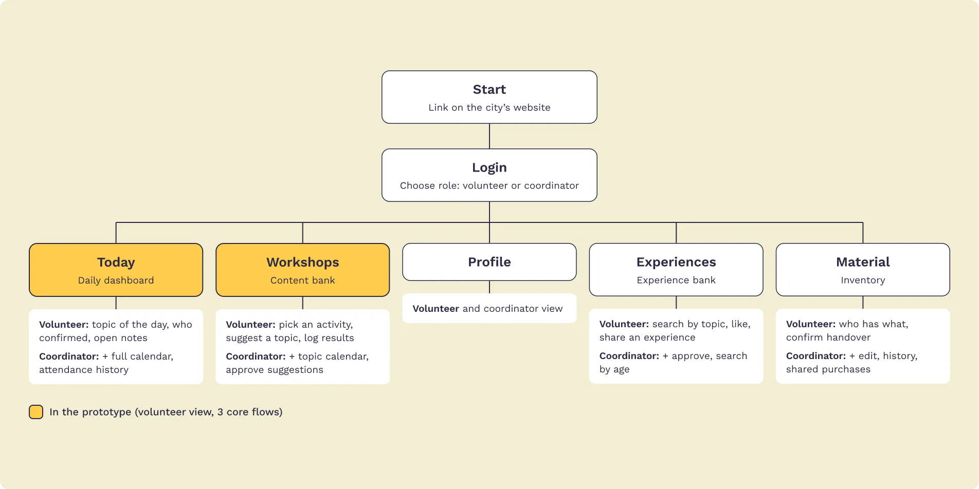
The full product has two roles (coordinator and volunteer) and five areas. For this 2-month project I focused on the volunteer view and its three main user flows. The coordinator view is planned.
05Information architecture
The sitemap covers five areas: Today, Workshops, Profile, Experiences and Material. I mapped them in detail for both roles, but the project grew too large for two months, so I prototyped only the highlighted areas.
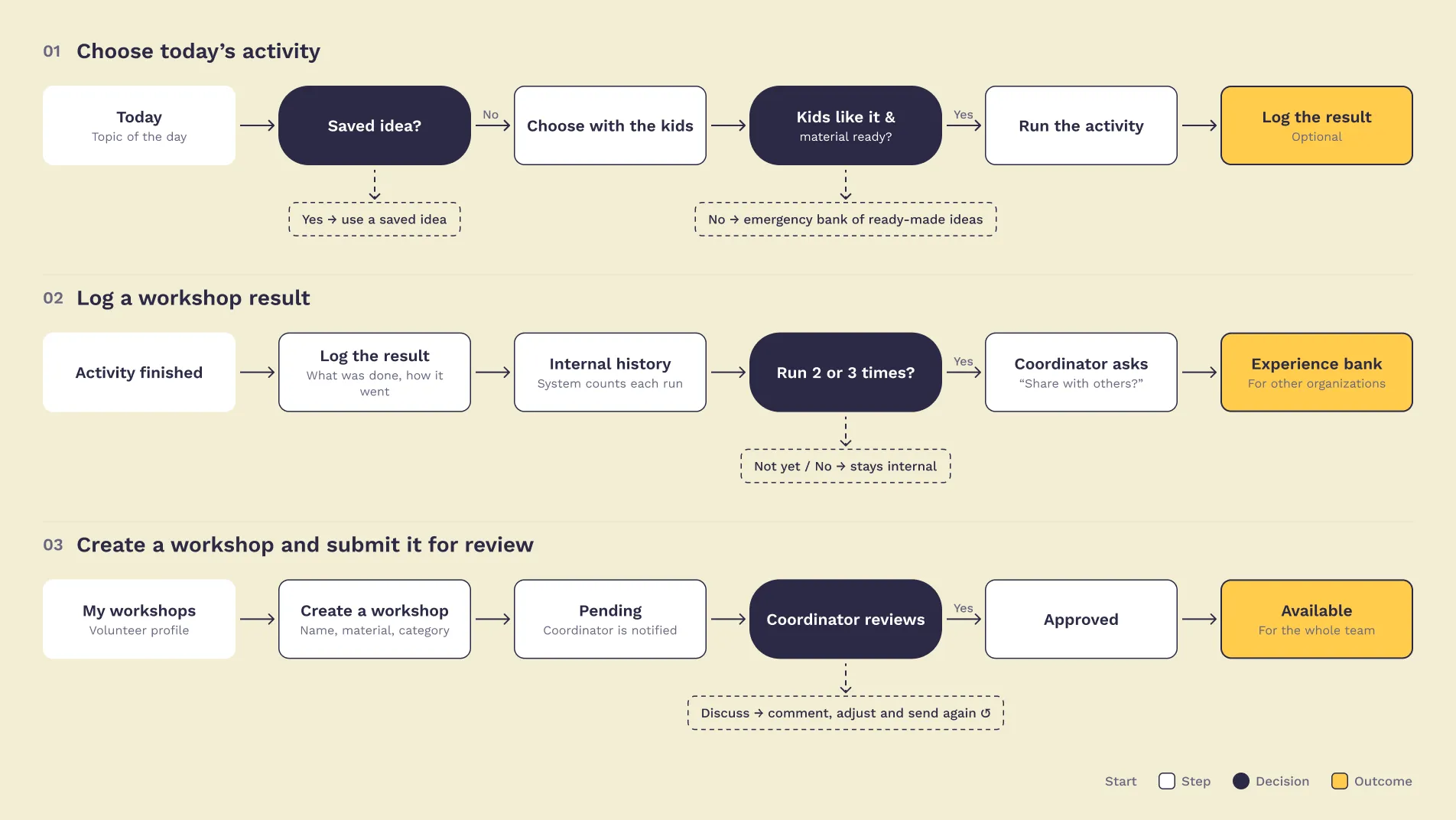
User flows
- 1Choose today’s activity
- 2Log a workshop result
- 3Create a workshop and submit it for review
06Design
Key decisions
- A progressive web app instead of a native app
- Lower cost to build and maintain than a native app, which matters for non-profit organizations. Shared through a link on the city’s website, with no download needed: a lower barrier for volunteers like Marta. There is often no internet at the venues, so volunteers use it on the way or at home.
- Focus on the volunteer, built for community
- Every feature supports the individual volunteer and connects them with others.
- Clear workshop statuses
- Draft, In discussion and Approved, so everyone knows where a workshop stands. Volunteers can save unfinished ideas as drafts.
- No open chat
- Confidential notes are only visible to the coordination team.
Design system
Built from scratch and documented as a developer handoff.
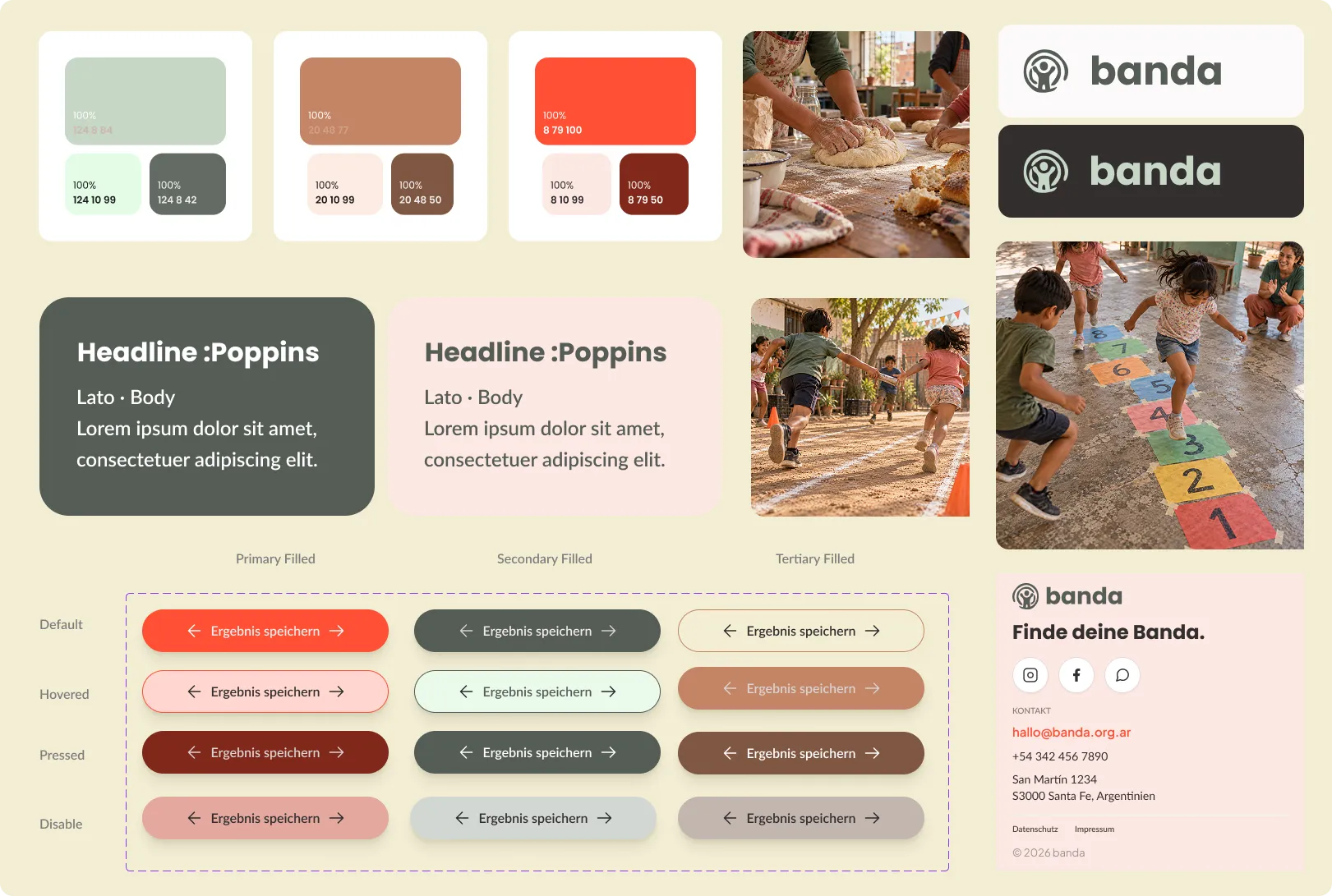
- Colors: sage green as primary, terracotta as secondary and a red-orange accent, each with a light, base and dark step, plus status colors and warm neutrals.
- Typography: Poppins for headings, Lato for body text and UI.
- Spacing on a 4 px base, 5 elevation levels, layout grid for mobile, tablet and desktop.
- Components with all states: buttons, cards, status tags, forms, navigation.
Mascots
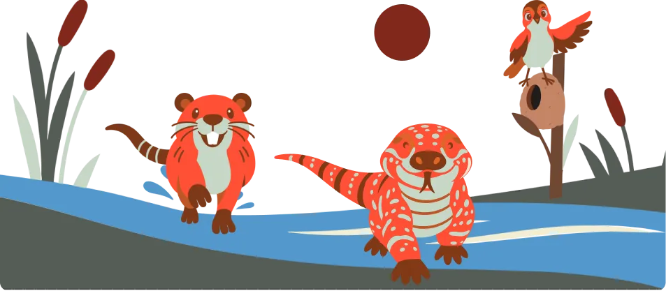
A family of characters I illustrated, inspired by the wildlife of the Paraná river around Santa Fe: a capybara (community), a yacaré overo caiman (protection and care) and a hornero, the bird that builds its nest from mud (work and home). They only appear at emotional moments, like success and thank-you screens.
07Final solution
- 01Choose today’s activity
Pick a ready-to-use activity for today’s workshop in a few taps.
- 02Log a workshop result
Note how the workshop went so the next volunteer can build on it.
- 03Create a workshop and submit it for review
Save an idea as a draft and send it to the coordination team for approval.
Photos in the prototype are AI-generated placeholders, to be replaced with real photos from the organizations.
08Next steps & learnings
Next steps
- Usability testing with volunteers from non-profit organizations in Santa Fe, starting with Marta’s profile
- Design the coordinator view
- Validate the interest in exchange between organizations
- Build the Material and Experiences areas
What I learned
Going back to research I did years ago showed me how much a solid research base makes later decisions easier, and how needs change over time. Building a design system from scratch taught me to think in reusable components from the start. And designing for users from students to retirees taught me that sometimes the best decision is what you leave out, like an open chat.
